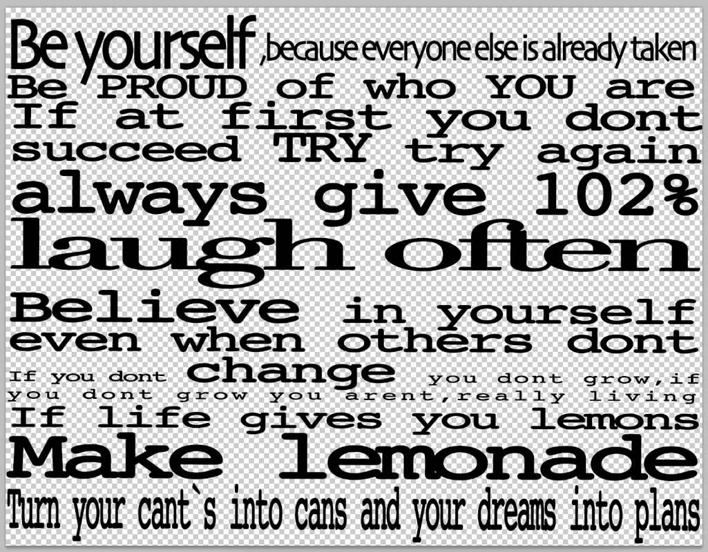
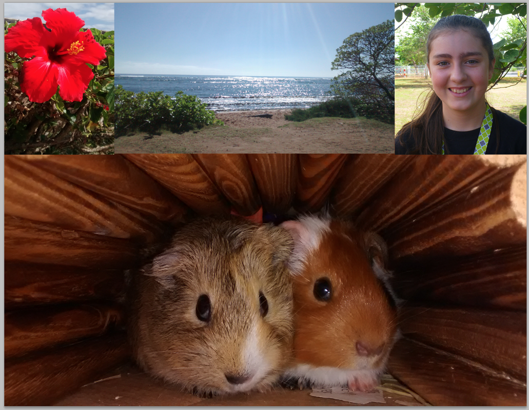
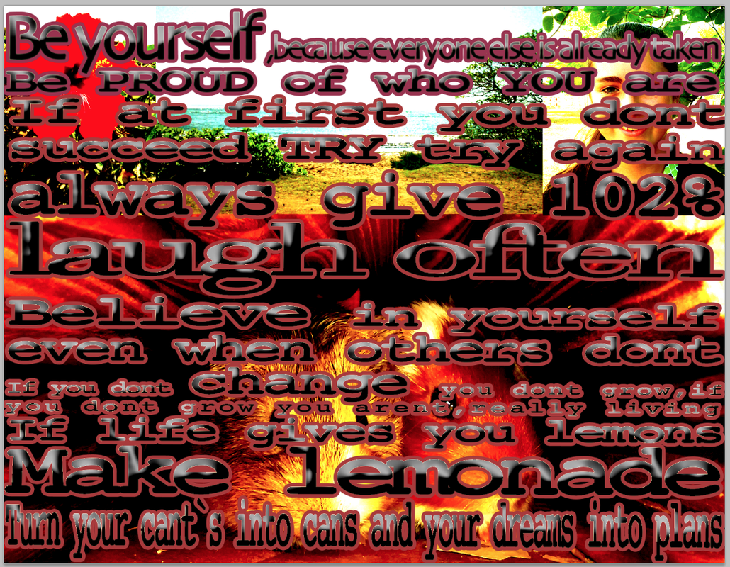
Right now in class we are working on a manifesto and for this project (like all others) we have requirements. first of all we have 6 Layer Requirements. the 6 layer requirements are, you must have 2 text layers, the two text layers that we must have are one of our manifesto, and one for our personal quotes. We also have 4 image layer requirements. The 4 image requirements are you must have 3 images that symbolize me, mine are my pigs, the ocean, and a flower. We also need to include a portrait of us so that is all for the layer requirements, and now for the design requirements. we have 4 design requirements witch are we have to Kern both of our text layers all the way across the page so there are no blank spaces or holes the 2nd design requirement is Triadic Color Scheme witch means we need 1 dominant color harmoniously balanced with 2 accent colors we also need Visual Balance visual balance is Equal weight of elements distributed in a design for visual proposes. last, but not least we need to use the Blending Options on our text layers and Adjustment layers on our 4 images.
so it is was kinda hard to make it, but today I am gonna tell you step by step how to make one. First type out a list of quotes, I recommend on a drive document,or blog, so that you are able to copy and paste all of your quotes. Then once you got about 10 open up photoshop, create a new document, and open up a typing box, and go to your blog,or drive, copy and paste (command C, command V) your list of quotes to the type box. Once you have your text in, click the kerning option if you have absolutely, positively no idea what kerning is, click here for a definition. Start to kern your text so that it fits end to end. keeping in mind this is the hardest step of this project, it takes time to do,so dont get frustrated if it takes a long time, since i did mine in class, it was done in a sequence so I probably worked on it for about 30 minutes a day for 4 days so it took a long time. After you finish kerning (or if you want a break from it) find 3 images that symbolize you and get them in, organize them along with a portrait of you. this takes a bit of time, but not as long as kerning. After you can add some effects to your text and pictures after you finish with all of that then you can turn both layers on, so you can see your final project.
So there are definitely some improvements I could make to my final. first of all I could of adjusted the kerning so that none of the outer glow was touching each others edges. When I kerned I kerned it in perfectly, but once I added in the effects, like the outer glow, the outer edges of the words were touching each other. So i needed to go back and kern them again. It was also really hard to get the text and the images match each other. I ended up with colors in the red/orange category, with some tints of purple. And that is about it for today fellow readers of my blog,till next time, STAY HAPPY!
 |  |
 RSS Feed
